Project
SPOT
Year
2026
Services
Branding
Packaging
Product Visualization
Overview
Spot began with a short brief and a rare amount of freedom: build a new brand from zero for a private client, and make it impossible to miss. The result is a full identity and packaging system for a street-inspired product line aimed at a younger audience. Orange and black do the heavy lifting. Everything else stays quiet.
Challenge
The shelf is loud. Most new products arrive wearing the same gradients, the same swooshes and the same promises, and a younger shopper decides in about a second. Spot needed to look like a brand with a point of view before anyone picked it up, without shouting the way everything around it does.
Solution
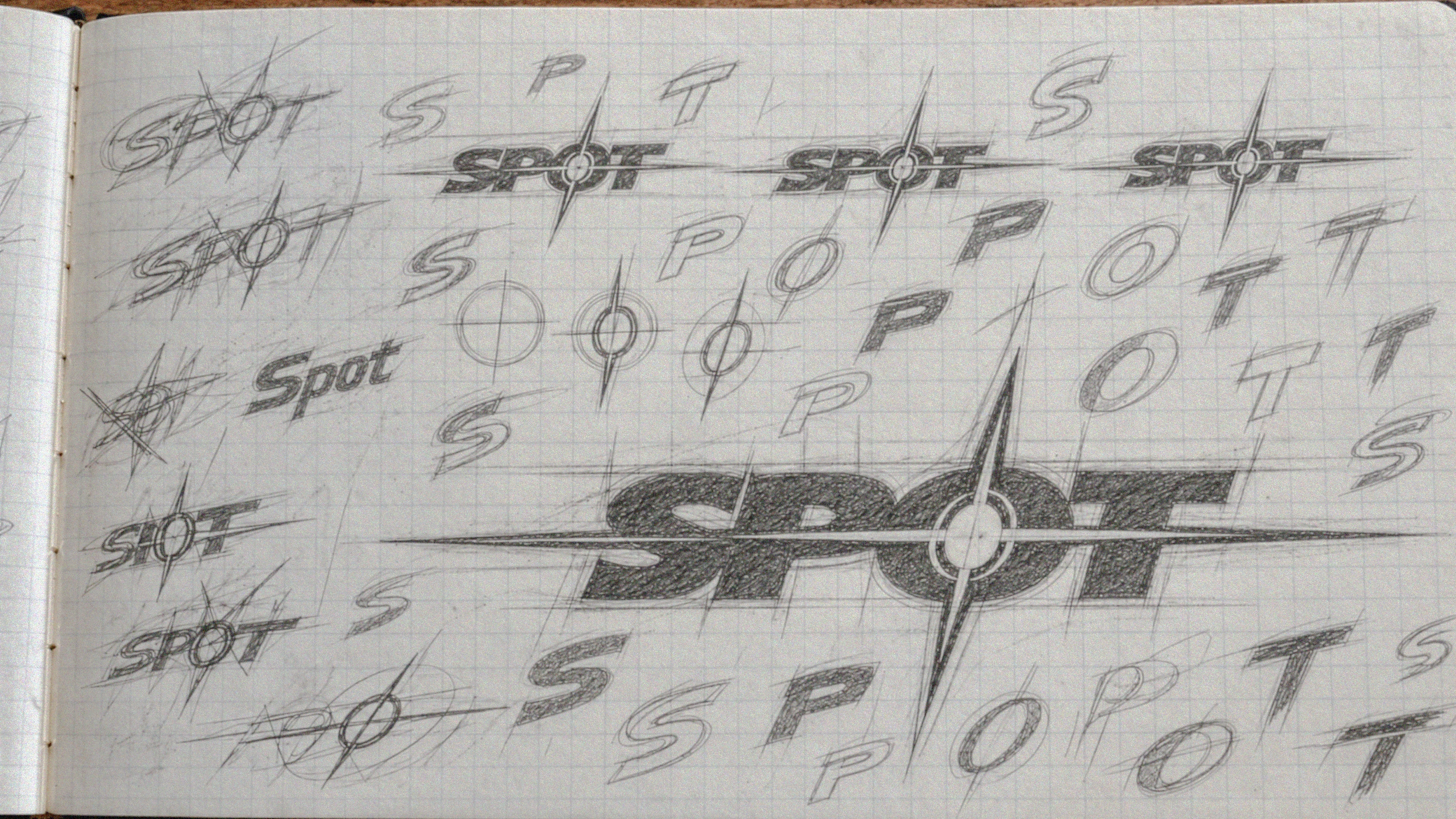
I started with what a hazard cone, a street sign and a skate sticker all know: orange against black gets read before it gets understood. The mark is a heavy, forward-leaning wordmark with a four-point burst through its center, built to hold at thumbnail size and at storefront size. A strict palette of orange, black and one neutral keeps every pack consistent, while a flavor band and a clear strength callout carry the variation. The box and the pouch share one label anatomy, so the range reads as a family from across the aisle.
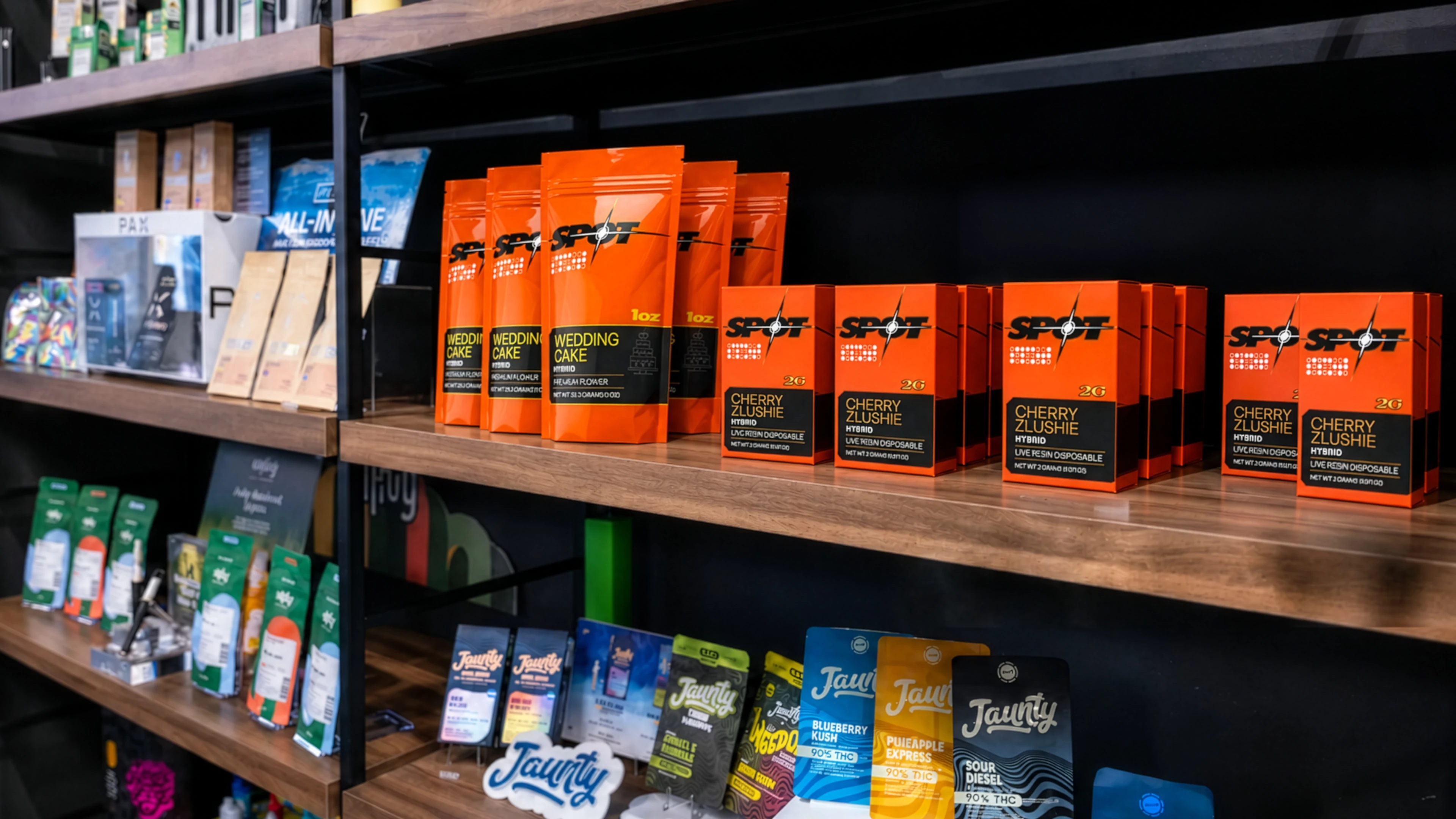
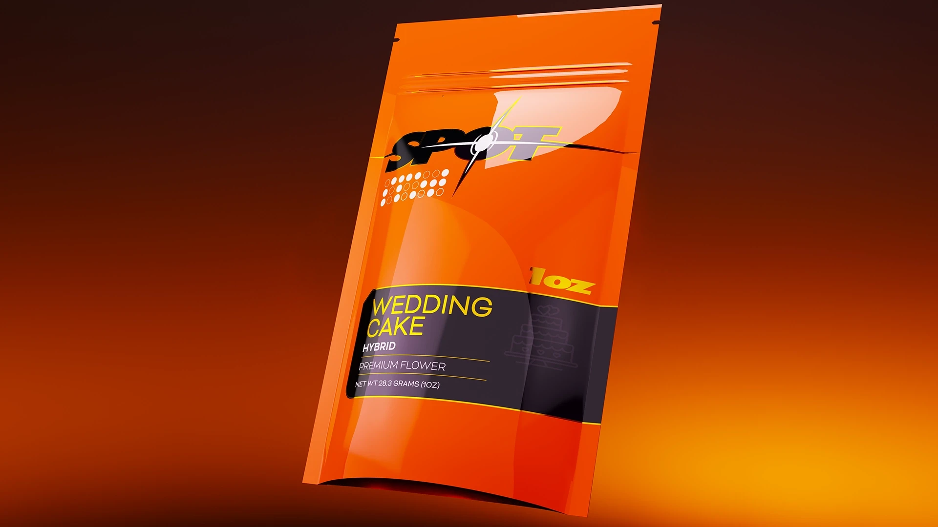
The finished system covers the logo, the color rules, the label anatomy, a box and a pouch, and a retail and lifestyle world that shows the brand in use. Every pack was built and lit in Blender before any print run, so the shelf presence could be judged on screen first.
Link




Challenge
The shelf is loud. Most new products arrive wearing the same gradients, the same swooshes and the same promises, and a younger shopper decides in about a second. Spot needed to look like a brand with a point of view before anyone picked it up, without shouting the way everything around it does.
Solution
I started with what a hazard cone, a street sign and a skate sticker all know: orange against black gets read before it gets understood. The mark is a heavy, forward-leaning wordmark with a four-point burst through its center, built to hold at thumbnail size and at storefront size. A strict palette of orange, black and one neutral keeps every pack consistent, while a flavor band and a clear strength callout carry the variation. The box and the pouch share one label anatomy, so the range reads as a family from across the aisle.
The finished system covers the logo, the color rules, the label anatomy, a box and a pouch, and a retail and lifestyle world that shows the brand in use. Every pack was built and lit in Blender before any print run, so the shelf presence could be judged on screen first.
Project
SPOT
Year
2026
Services
Branding
Packaging
Product Visualization
Overview
Spot began with a short brief and a rare amount of freedom: build a new brand from zero for a private client, and make it impossible to miss. The result is a full identity and packaging system for a street-inspired product line aimed at a younger audience. Orange and black do the heavy lifting. Everything else stays quiet.
Challenge
The shelf is loud. Most new products arrive wearing the same gradients, the same swooshes and the same promises, and a younger shopper decides in about a second. Spot needed to look like a brand with a point of view before anyone picked it up, without shouting the way everything around it does.
Solution
I started with what a hazard cone, a street sign and a skate sticker all know: orange against black gets read before it gets understood. The mark is a heavy, forward-leaning wordmark with a four-point burst through its center, built to hold at thumbnail size and at storefront size. A strict palette of orange, black and one neutral keeps every pack consistent, while a flavor band and a clear strength callout carry the variation. The box and the pouch share one label anatomy, so the range reads as a family from across the aisle.
The finished system covers the logo, the color rules, the label anatomy, a box and a pouch, and a retail and lifestyle world that shows the brand in use. Every pack was built and lit in Blender before any print run, so the shelf presence could be judged on screen first.
Link
Challenge
The shelf is loud. Most new products arrive wearing the same gradients, the same swooshes and the same promises, and a younger shopper decides in about a second. Spot needed to look like a brand with a point of view before anyone picked it up, without shouting the way everything around it does.
Solution
I started with what a hazard cone, a street sign and a skate sticker all know: orange against black gets read before it gets understood. The mark is a heavy, forward-leaning wordmark with a four-point burst through its center, built to hold at thumbnail size and at storefront size. A strict palette of orange, black and one neutral keeps every pack consistent, while a flavor band and a clear strength callout carry the variation. The box and the pouch share one label anatomy, so the range reads as a family from across the aisle.
The finished system covers the logo, the color rules, the label anatomy, a box and a pouch, and a retail and lifestyle world that shows the brand in use. Every pack was built and lit in Blender before any print run, so the shelf presence could be judged on screen first.