Challenge: The supplement category splits into two extremes: sterile clinical branding or loud, hype-driven wellness. Neither suited a product built on patience and long-term results. Solem needed to feel premium and credible without pharmaceutical coldness, and needed a system flexible enough to grow into multiple product lines while staying cohesive. The challenge: build trust through restraint, communicating efficacy without clinical buzzwords and quality without cold.
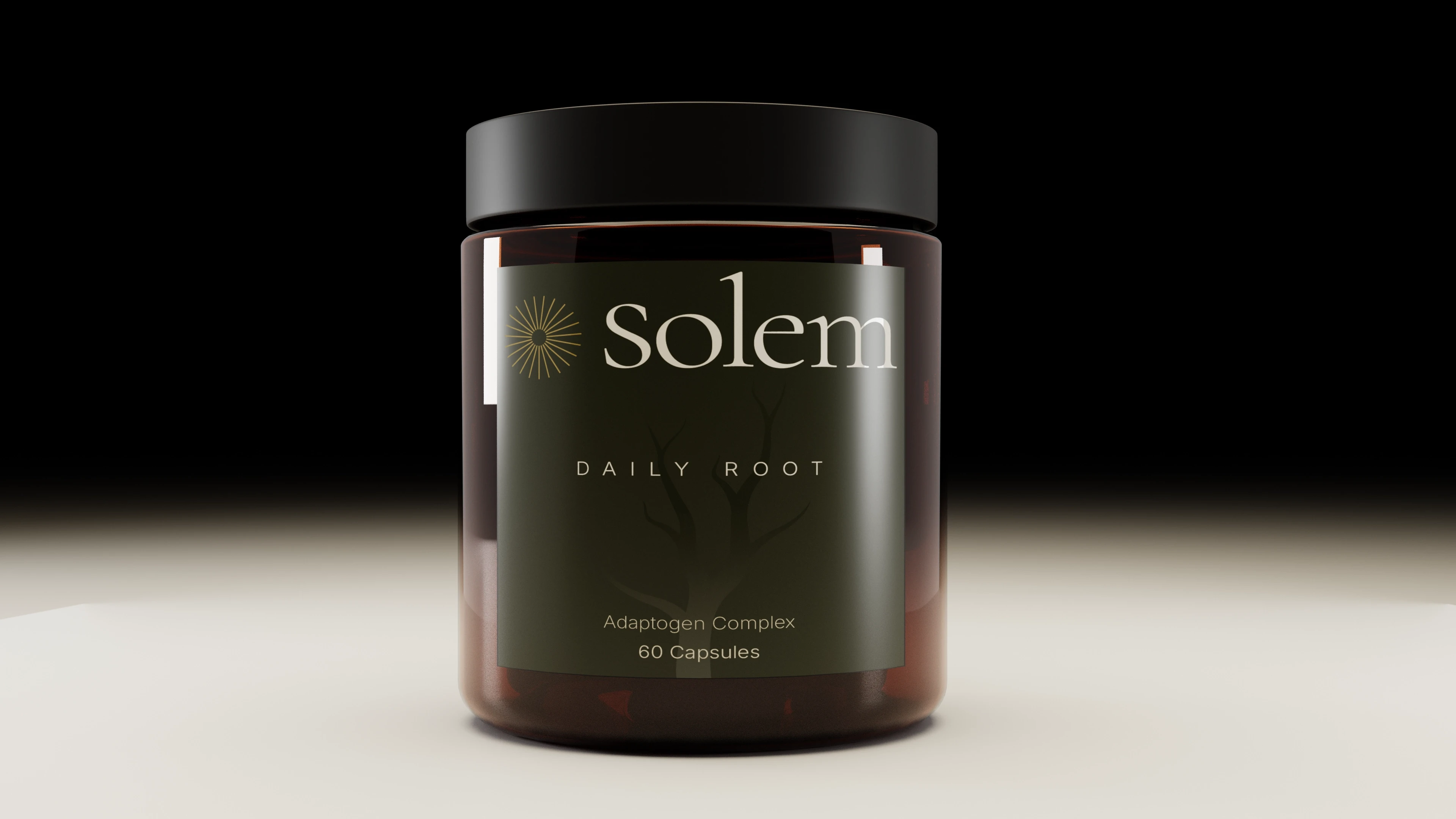
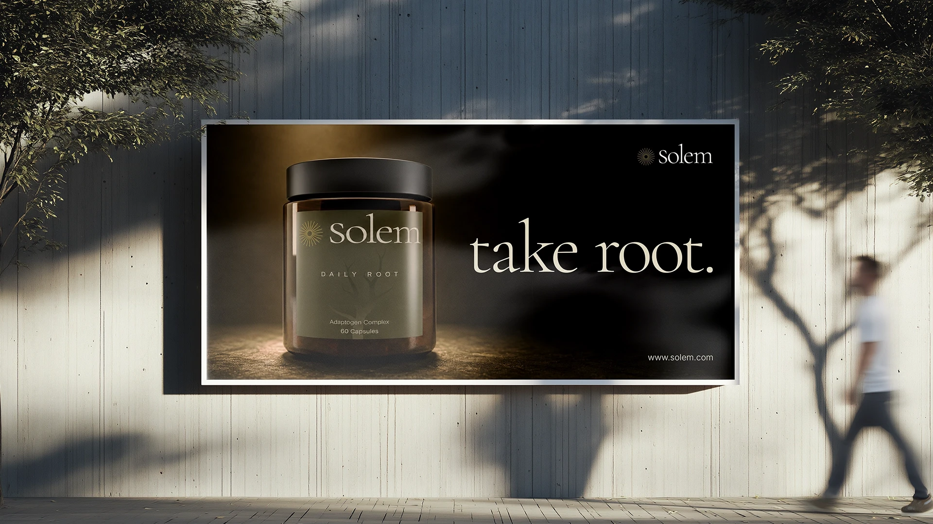
Solution: Solem's identity draws on apothecary tradition, pairing a sunburst mark with a root motif to capture its core idea: energy from above, stability from below. A deep olive and warm ivory palette with a restrained gold accent replaces the category's usual pastels and clinical white. Amber glass packaging, an editorial serif wordmark, a letter-spaced sans product name, and minimal descriptor copy borrow from perfumery rather than supplement shelving. The result is a quiet, confident system built to hold a countertop, with room to extend cleanly across future formulas.