Atlas

OVERVIEW

ATLAS is a packaging and label design system for a line of research-grade peptide products, currently spanning a lyophilized vial format (BPC-157) and a nasal spray format (NAD+). The design establishes a consistent brand identity, built around a dark red palette, a globe/wireframe motif, and a clean sans-serif mark, applied across differing container types and label geometries.

YEAR

2026

ROLE

Brand Designer / Packaging Designer

SERVICES

Branding

Packaging

Product Visualization

About the project

Challenge: Research-use peptide products occupy an unusual space: they carry pharmaceutical-grade expectations around purity, traceability, and safety documentation, yet they're explicitly not drugs and can't lean on consumer pharma branding conventions. A single generic label won't work across formats either, since a cylindrical vial with a crimp cap and a nasal spray bottle with a pump actuator present completely different surface areas, curvatures, and information hierarchies. Without a system in place, it becomes easy for a product line to look disjointed as it grows.

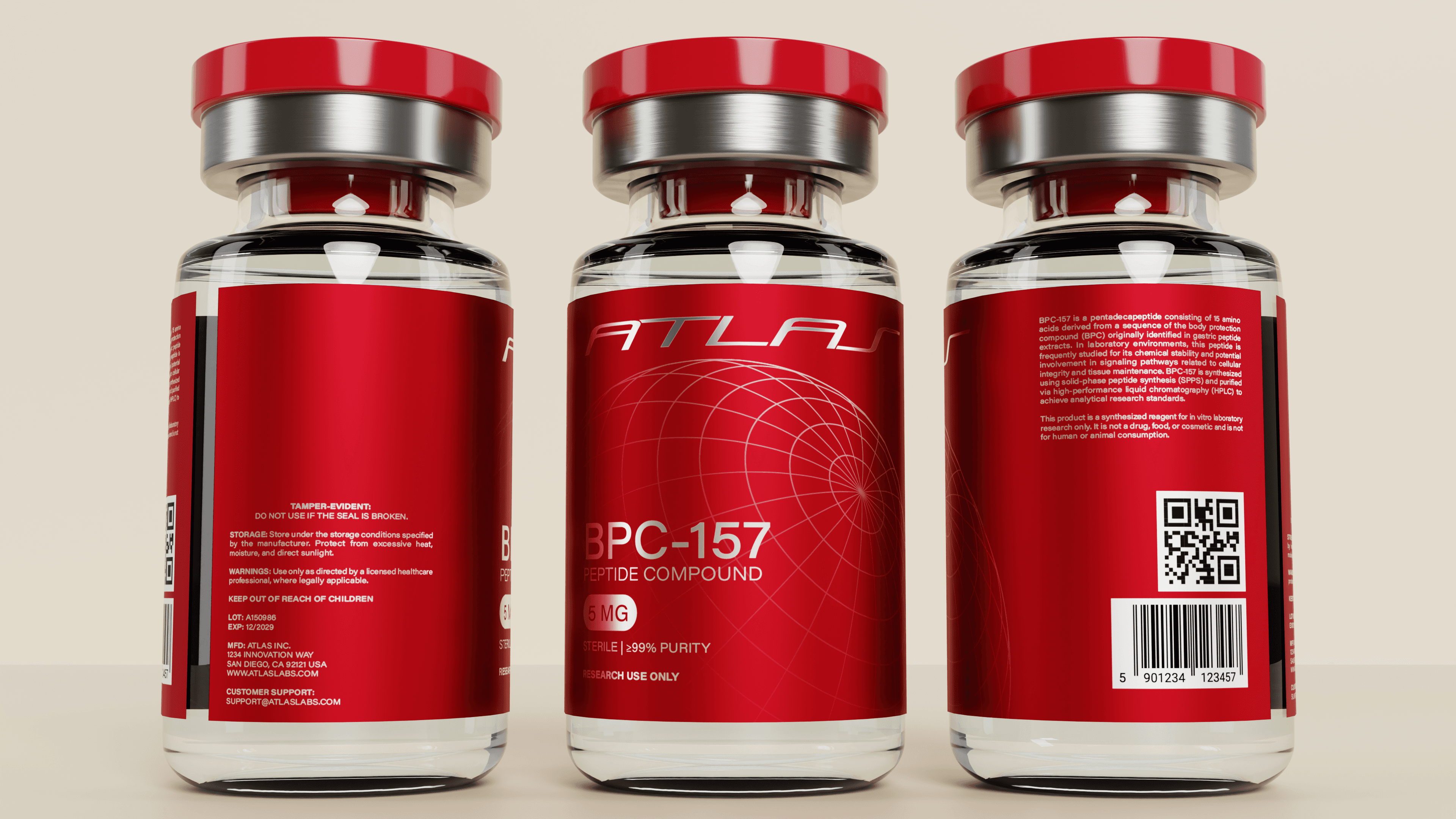
Solution: A unified label system built around a shared visual language rather than a single fixed template. The red-and-silver color scheme, the wireframe globe graphic, and the ATLAS wordmark stay constant, while the layout adapts per format. Front labels lead with product name, dosage, and purity. Side and back labels carry the compound description, QR code, barcode, lot and expiration data, and required tamper-evident and research-use disclaimers. This keeps every SKU instantly recognizable as part of the same line while giving each format the label real estate it needs.
Atlas

OVERVIEW

ATLAS is a packaging and label design system for a line of research-grade peptide products, currently spanning a lyophilized vial format (BPC-157) and a nasal spray format (NAD+). The design establishes a consistent brand identity, built around a dark red palette, a globe/wireframe motif, and a clean sans-serif mark, applied across differing container types and label geometries.

YEAR

2026

ROLE

Brand Designer / Packaging Designer

SERVICES

Branding

Packaging

Product Visualization

About the project

Challenge: Research-use peptide products occupy an unusual space: they carry pharmaceutical-grade expectations around purity, traceability, and safety documentation, yet they're explicitly not drugs and can't lean on consumer pharma branding conventions. A single generic label won't work across formats either, since a cylindrical vial with a crimp cap and a nasal spray bottle with a pump actuator present completely different surface areas, curvatures, and information hierarchies. Without a system in place, it becomes easy for a product line to look disjointed as it grows.

Solution: A unified label system built around a shared visual language rather than a single fixed template. The red-and-silver color scheme, the wireframe globe graphic, and the ATLAS wordmark stay constant, while the layout adapts per format. Front labels lead with product name, dosage, and purity. Side and back labels carry the compound description, QR code, barcode, lot and expiration data, and required tamper-evident and research-use disclaimers. This keeps every SKU instantly recognizable as part of the same line while giving each format the label real estate it needs.

Atlas

OVERVIEW

ATLAS is a packaging and label design system for a line of research-grade peptide products, currently spanning a lyophilized vial format (BPC-157) and a nasal spray format (NAD+). The design establishes a consistent brand identity, built around a dark red palette, a globe/wireframe motif, and a clean sans-serif mark, applied across differing container types and label geometries.

YEAR

2026

ROLE

Brand Designer / Packaging Designer

SERVICES

Branding

Packaging

Product Visualization

About the project

Challenge: Research-use peptide products occupy an unusual space: they carry pharmaceutical-grade expectations around purity, traceability, and safety documentation, yet they're explicitly not drugs and can't lean on consumer pharma branding conventions. A single generic label won't work across formats either, since a cylindrical vial with a crimp cap and a nasal spray bottle with a pump actuator present completely different surface areas, curvatures, and information hierarchies. Without a system in place, it becomes easy for a product line to look disjointed as it grows.

Solution: A unified label system built around a shared visual language rather than a single fixed template. The red-and-silver color scheme, the wireframe globe graphic, and the ATLAS wordmark stay constant, while the layout adapts per format. Front labels lead with product name, dosage, and purity. Side and back labels carry the compound description, QR code, barcode, lot and expiration data, and required tamper-evident and research-use disclaimers. This keeps every SKU instantly recognizable as part of the same line while giving each format the label real estate it needs.

Available for Hire

calvaradodesign@gmail.com

6:02:15 PM

Available for Hire

calvaradodesign@gmail.com

6:02:15 PM

Available for Hire

calvaradodesign@gmail.com

6:02:15 PM